How to Improve Your Visual Identity

When someone first sees your brand, what is their immediate impression? Are they met with playfulness and excitement, or sophistication and elegance? Is the aesthetic bright and bold, or muted and subtle?
The term “visual identity” refers to a collection of visual elements that serve to represent and differentiate a brand. A visual identity acts as your brand’s visual language to reinforce core values and brand mission through visible mediums, such as a logo, color palette, typography, and imagery. It has the ability to quickly evoke an emotional response from your audience, and inform them of what your company has to offer – making it a vital component of your marketing plan.
Here are 3 simple ways you can improve your visual identity to better communicate your brand’s message and value:
1. TELL A COMPELLING STORY
Visuals are a great way to tell your brand story and reinforce your company’s tone and voice. Be sure to use colors, graphics, and typography to reinforce your brand’s personality and – if possible – explain what you do.
Amazon is a great example of how a single design choice can help communicate multiple messages to the target audience. The arrow between the “A” and “Z” has multiple meanings. The symbol is a nod to the wide range of products they offer, and also indicates the efficiency with which products are delivered. Additionally, the yellow arrow resembles a smile, indicating customer satisfaction. This small but intentional element is the perfect example of the power of visual storytelling.
2. KEEP IT SIMPLE
End-users are flooded with information from countless brands every day, all trying to win their attention. Choose clean and simple visuals in order to cut through the noise and communicate your message clearly and efficiently.
It can be tempting to use brand visuals as an opportunity to highlight ALL that your brand has to offer, but it’s important to have a focus. Decide on the single most important message and choose a visual identity that speaks to that. Other elements of your business can be highlighted elsewhere, so remember your visual identity doesn’t have to tell the entire story.
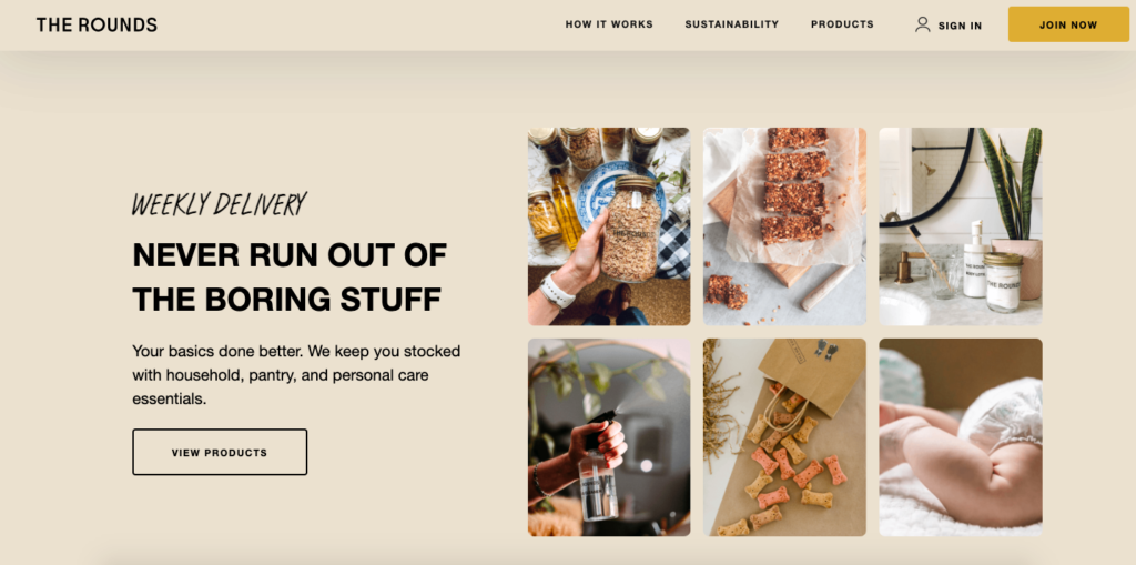
A brand that does this well is The Rounds, a company that offers zero-waste deliveries and refills on staple items. Their minimalistic web design reflects their dedication to sustainability, zero-waste, and eco-friendly alternatives to essential items.
3. DESIGN FOR THE PLATFORM
When it comes to your visual identity, never assume that the elements you choose will seamlessly apply to all platforms (desktop, mobile, print, etc.). Visuals that are perfect for one medium might not work for another, so be sure to build a suite of visual elements that are optimized for each platform, while maintaining enough consistency to maintain your visual identity.
These are just a few of the ways your brand can strengthen its visual identity, and it’s important to note that the approach will vary depending on your company’s needs. If you’re looking for marketing support to help your business reach its highest potential, reach out to [email protected] and we’ll be in touch!